Guide to Tables
This guide helps you work more efficiently with tables that can be found in CDP&CRM CareCloud! We will walk you through different actions and controls to show you their effect on tables. On this page, you will be navigated through different types of tables in the various CareCloud apps to help you use them to the maximum of their capacity.
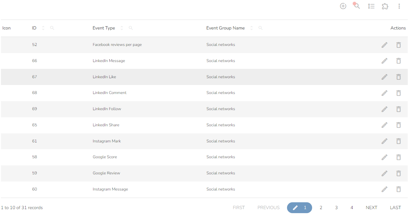
This guide describes different parts of a table, namely the Action row, a header below the Action row, icons next to columns, Action icons next to rows, and pagination at the bottom of the table.
You see a standard table view below. Rows are separated by color for better orientation, and column names are in bold.

Action Row
You can find the table's action row in the far right corner of the table.

By clicking on the tag icon, a dropdown with a list of tags comes up if available. You can filter the displayed table contents and select up to three labels in various combinations.
![]()
Add a new item to the table using the Add new icon.
![]()
Search in the table icon lets you search the entire table content (as opposed to searching in a column, which is described here).
![]()
Search by writing a phrase and pressing enter. Searching is not case-sensitive.

The result is the filtered table containing only items with the selected phrase.
Pick how many rows you want to display on one page with the Number of rows displayed icon.
![]()
A dropdown will open with the following choices.

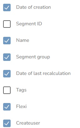
The next icon is Columns to display select.

Tick which columns you want to see in the table.
If the table contains too many columns to fit into the default view, there's a slider available.

To export the table's content, click on the Table content export icon.

A dropdown appears. Export the table's content using one of the following options.
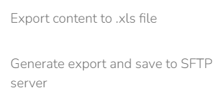
The first option is .xls export. This way, the table content is exported without personal data. When you choose .xls, the progress bar appears.
Once the export finishes, click on the export icon again to show the option to download the file.
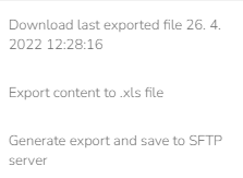
Click on the file option with the timestamp to initiate the download.
The second option is to export the data and save it to an SFTP server. This option exports the whole table, including the personal data. The file is created in an SFTP directory. In order for SFTP export to work, you need to set it up with your project manager.
The rest of the table controls are under the Next options icon.
![]()
A modal window with a list of additional options comes up after clicking.
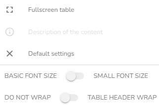
When you select the Fullscreen table option, the table maximizes this form:
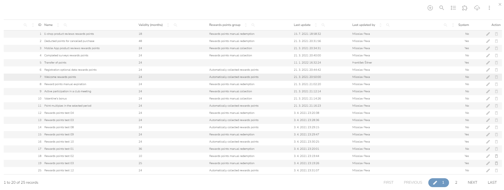

Choose between the two font sizes with the Basic font size and Small font size switch.

This is what the basic font size looks like.

By choosing a small font size, you manage to fit more columns and rows into the same area.

You choose whether to wrap the text in the header with this switch. Wrapping the header's text widens the column.
Switch:

Use the "Default settings" option to change the table's settings to the default.

Pagination
The pagination row is at the bottom of the table with options for jumping to the First page, the Previous page or going to the Next or Last page. You can manually enter which page you want to view by clicking on the blue icon with a pencil and entering the requested page number.

Column Icons
You will find two icons next to every column.
You can search in a specific column with the Search in the column icon instead of the entire table.

When you're searching in a column, a modal window appears:

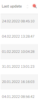
After entering the requested value, the icon is marked with a red dot, and the actual search results show up like this:
Use the arrow icon to sort the table's content by a column:

When you sort by column, the entire column becomes darker, and the table's sorting changes to ascending or descending order based on the column's data. One option is to sort by one column only; when you choose to sort by another one, the previous sorting is overwritten by the current one.
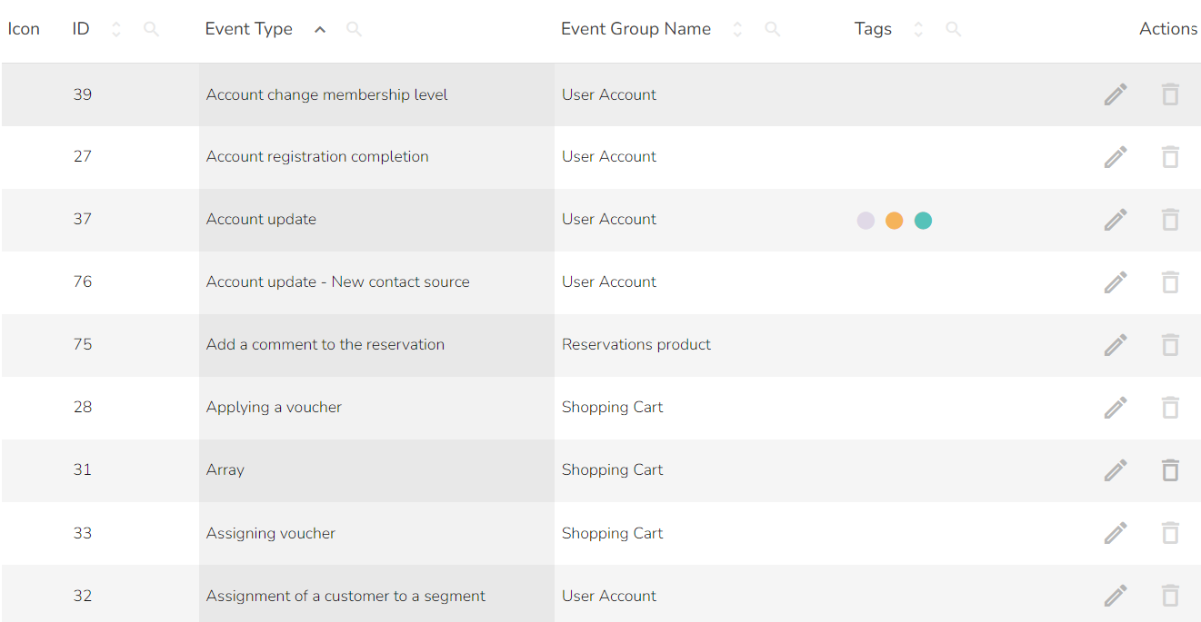
The other option is to sort by multiple columns by holding "shift" and clicking on the Sort by column icon. This way, you can select how many columns you want and sort by those.

Actions Icons
There's a set of different icons in the column called Actions icons within the table.
You can delete the item from the table with the Delete icon.

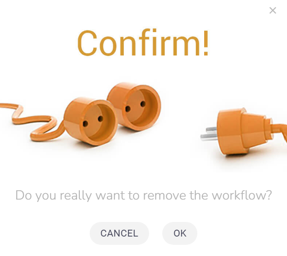
You need to confirm this action in a modal window that shows up before the item is completely deleted.
You can edit the item with the Edit icon.

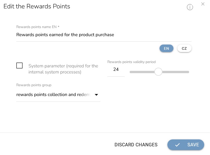
A modal window appears, allowing you to edit the data. This is an example of what the modal window looks like within a Rewards points table.
Duplicate items with the Duplicate icon.

View items in more detail with the View icon.

You also choose the order of items. You move the item up with the Move up icon if available.

And move the item down with the Move down action icon if available.
