Responsiveness
The template is responssive to smaller devices by default, however you can adjust the responsiveness settings for the Products element separately.
Adjusting the responsiveness settings helps you maintain a cohesive form of the email across different email providers and devices.
Click the "Responsiveness" icon.
![]()
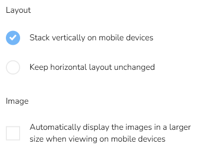
Select how the layout should adapt and whether images should appear larger when viewed on mobile devices.
